At CYFRON SOFTWARE TRADING, we often see the same pattern in digital product work: a team has strong visual designs, clear product intent, and motivated developers, yet the handoff still creates friction. The reason is simple. Static screens rarely explain how an interface should behave.
A good example is the shift from a 60-day group challenge app into a daily habit tracking product. On the surface, this sounds like a redesign. In practice, it is a deeper product evolution. New flows are needed for creating habits, tracking progress, handling repeated actions, and managing navigation across the app. A polished screen deck can show what the product looks like, but not always how it works.
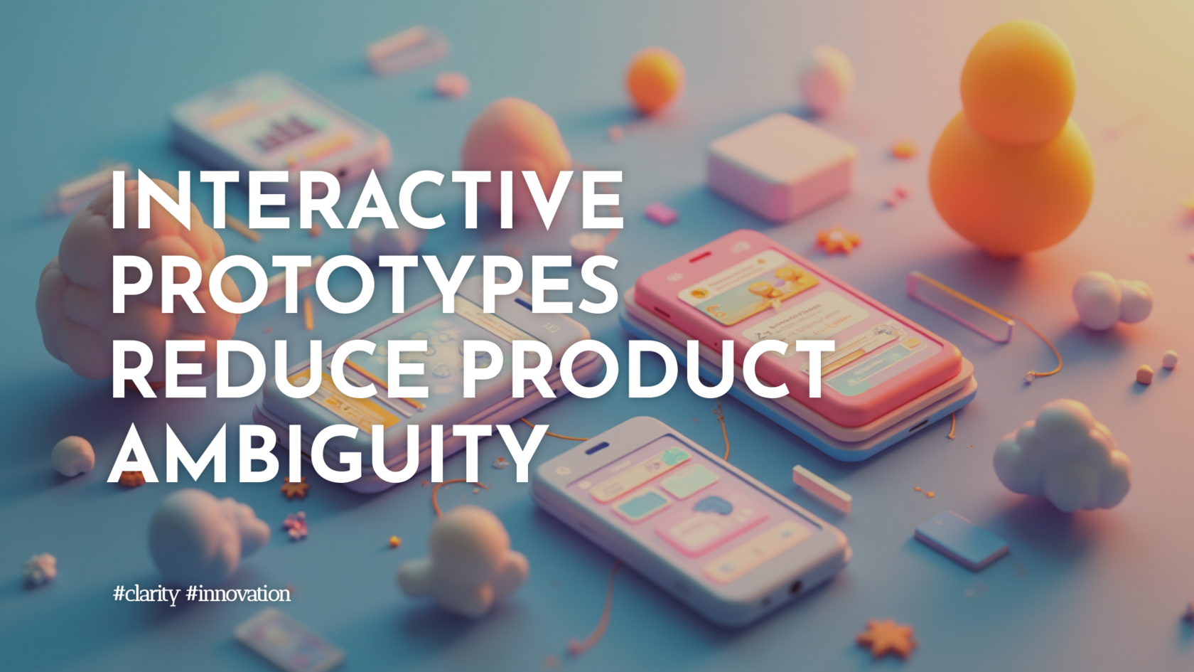
This is where interactive prototyping becomes especially valuable.
Using Figma Make to turn Figma designs into high-fidelity prototypes creates a much better bridge between design and development. Instead of wiring together many static screens manually, teams can bring in design frames, define behavior through prompts, and refine interactions directly in the prototype. That changes the handoff from a visual presentation into something much closer to a working product.
For developers, this brings practical benefits. Navigation logic becomes clearer. Edge cases become visible earlier. Habits with more complex rules, such as completing an activity 3 times per day or 4 times per week, can be explored before implementation. Details like bottom tab behavior, bottom sheets, completed-state indicators, and local state storage stop being abstract notes and become testable interactions.
For product teams, the value is just as important. It becomes easier to validate whether a flow is actually intuitive. Can users create a new habit with a custom icon, color, and frequency without friction? Does progress tracking feel simple or overly detailed? Are visual cues, spacing, and component states consistent enough to support trust and clarity? These are questions best answered in motion, not in static mockups.
We also see strong value in pairing interactive prototypes with lightweight design guidelines. Documenting layout rules, styling principles, color logic, and spacing choices, even something as specific as 8-pixel vertical padding, reduces ambiguity and improves consistency. When those guidelines sit close to the prototype and code, teams can move faster with fewer misunderstandings.
Another meaningful advantage is publication and sharing. A live prototype link gives developers, stakeholders, and testers richer context than traditional handoff files. It helps everyone align on behavior, not just appearance.
The broader lesson is clear: modern interface design is no longer only about drawing screens. It is about expressing intent in a form that developers can build from confidently and users can understand naturally.
At CYFRON, we believe the most effective graphical interfaces combine usability, aesthetic clarity, and practical implementation. Interactive prototyping supports all three. It shortens feedback loops, improves collaboration, and helps digital products feel coherent long before production begins.
A good example is the shift from a 60-day group challenge app into a daily habit tracking product. On the surface, this sounds like a redesign. In practice, it is a deeper product evolution. New flows are needed for creating habits, tracking progress, handling repeated actions, and managing navigation across the app. A polished screen deck can show what the product looks like, but not always how it works.
This is where interactive prototyping becomes especially valuable.
Using Figma Make to turn Figma designs into high-fidelity prototypes creates a much better bridge between design and development. Instead of wiring together many static screens manually, teams can bring in design frames, define behavior through prompts, and refine interactions directly in the prototype. That changes the handoff from a visual presentation into something much closer to a working product.
For developers, this brings practical benefits. Navigation logic becomes clearer. Edge cases become visible earlier. Habits with more complex rules, such as completing an activity 3 times per day or 4 times per week, can be explored before implementation. Details like bottom tab behavior, bottom sheets, completed-state indicators, and local state storage stop being abstract notes and become testable interactions.
For product teams, the value is just as important. It becomes easier to validate whether a flow is actually intuitive. Can users create a new habit with a custom icon, color, and frequency without friction? Does progress tracking feel simple or overly detailed? Are visual cues, spacing, and component states consistent enough to support trust and clarity? These are questions best answered in motion, not in static mockups.
We also see strong value in pairing interactive prototypes with lightweight design guidelines. Documenting layout rules, styling principles, color logic, and spacing choices, even something as specific as 8-pixel vertical padding, reduces ambiguity and improves consistency. When those guidelines sit close to the prototype and code, teams can move faster with fewer misunderstandings.
Another meaningful advantage is publication and sharing. A live prototype link gives developers, stakeholders, and testers richer context than traditional handoff files. It helps everyone align on behavior, not just appearance.
The broader lesson is clear: modern interface design is no longer only about drawing screens. It is about expressing intent in a form that developers can build from confidently and users can understand naturally.
At CYFRON, we believe the most effective graphical interfaces combine usability, aesthetic clarity, and practical implementation. Interactive prototyping supports all three. It shortens feedback loops, improves collaboration, and helps digital products feel coherent long before production begins.